One form of poetry I have not previously played around with is the haiku. Its brevity and relative simplicity of rules made it a good candidate for a warm-up activity. So after reviewing the traditional rules and reading a few examples in French and English, the students and I spent half an hour or so coming up with quick "haiku comics".
(leer en castellano)
(lire en français)
Before starting we looked at a few examples of haiku comics that already exist to see what ways the form has been adapted to our medium. One of the things I find interesting about the 5-7-5 syllable structure is that there are a number of ways to think about how that might translate to comics.
Here are two very different haiku comics I found online. The first is by John Porcellino and you might describe it as evoking a haiku rather than adapting it faithfully: the sizes of the three panels seem to refer to the 5-7-5 structure, and the text, though not observing the syllabic rules, observe many other principles of the haiku: the present tense, a reference to nature, the obersvation of a fleeting moment. One student pointed out that the framing meta-panel could be seen as uniting the comic in a single, cosmic instant.
 |
| ©John Porcellino |
The next example is a webcomic by Mysh called Imaginary Encounters which uses the haiku has a base structure for a series of autobiographical one-page stories. In this case, the text is a fairly orthodox haiku (even if the subject matter, a dreamy gay travelogue, is far from traditional!) but the comics seems to mainly echo the three line structure in the form of three equally-sized tiers. One thing I particularly like about this example is the ironic counterpoint between the phrase "mountain top", a fairly classic nature reference, and the image of two lovers looking out their "mountain," the top-floor of window of a building. In another odd touch, we see that the place where they are is utterly flooded:
 |
| ©Mysh |
[NOTE: if you like what you see here, Mysh is currently trying to raise funds on indiegogo for a book collection of these strips. Please consider contributing here.]
We discussed other ways the syllable structure might be adapted, generally agreeing that Porcellino's relative size approach worked well. As a counter-example: we all agreed that though a three-page comic of 5 panels, 7 panels, 5 panels would be feasible it would be too long and against the spirit of a haiku. We left it up to each student to decide which aspects of haiku to adapt and which to disregard.
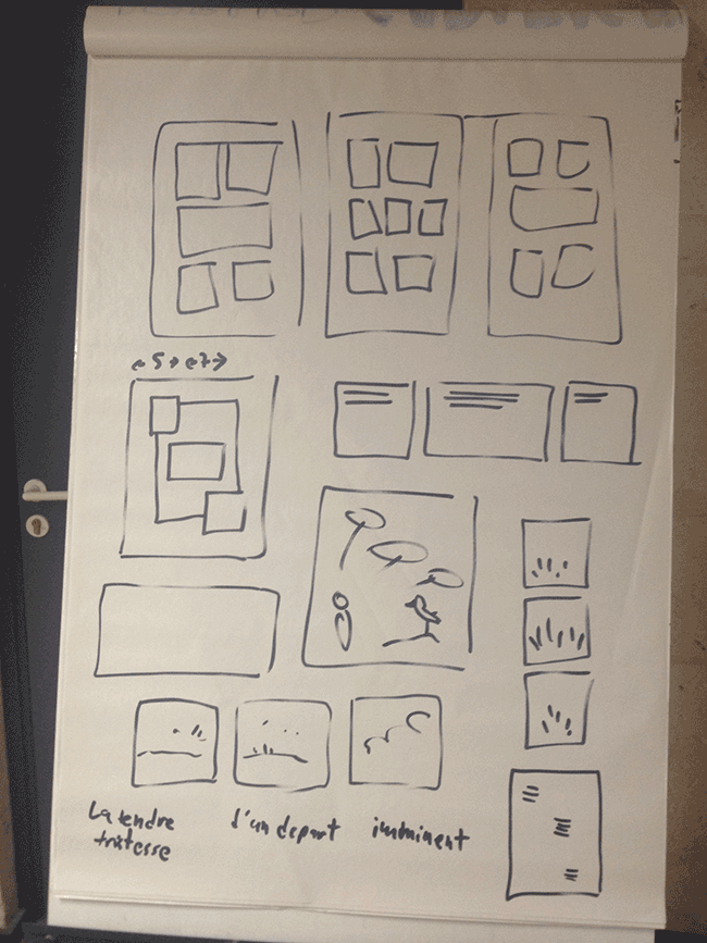 |
| some ways to adapt haiku into comics |
Here are a few examples from the class:
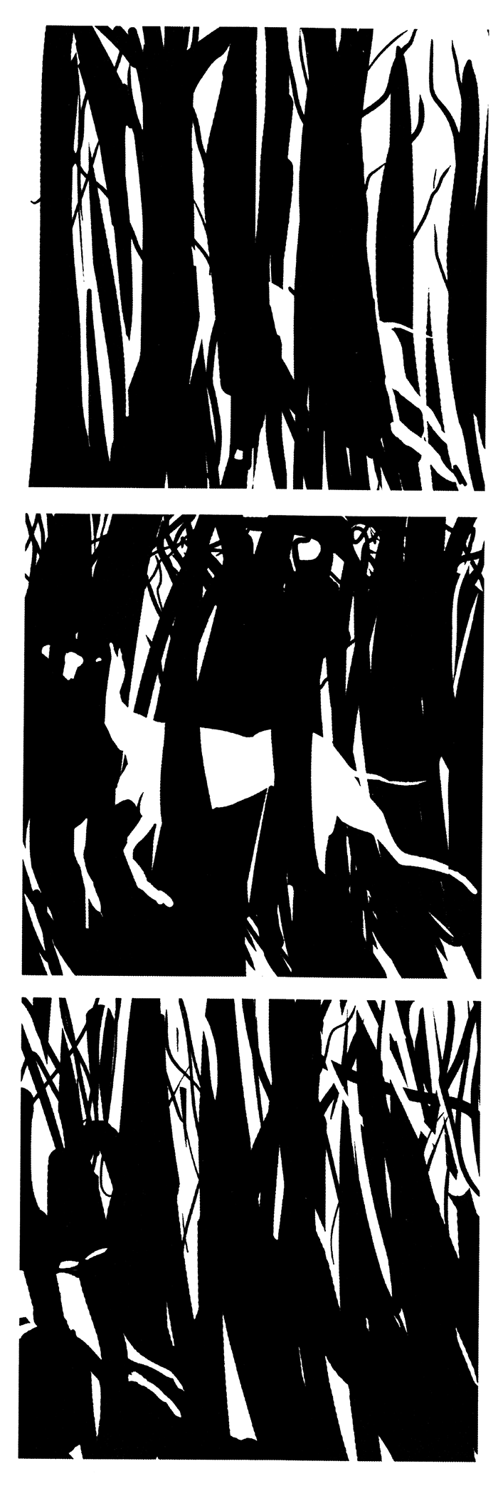
 |
| © Elisabeth Holleville |
[translation: On the mountain/amid the high grass/of your fur]
 |
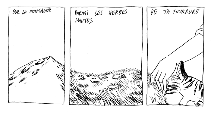
| © Timothée LeBoucher |
 |
| © Lise Lamarche |
[translation: Along with the birds/the great crane floats/above the water.]
I also made a few attempts myself. In the first one I tried to write a traditional haiku, referencing the present, a season, a moment in time, and so on (it was easy to think about nature and the seasons because it's been a long, gray spring here and in most of France). That said, I couldn't help put a modern, pop culture twist to it, since I was drawing all this in spitting distance of the Musée de la Bande Dessinée, which has a statue of Hugo Pratt's Corto Maltese keeping watch along the footbridge across the Charente river:
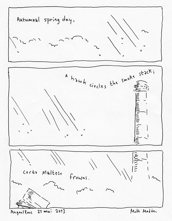
You can see that I used the 5-7-5 relative panel height principle here, cutting the space from top to bottom as the eye descends.
For the second comic, I flipped it sideways, thinking that was a more natural movement for the gaze of the haiku poet, surveying the landscape around her. An unusual aspect of this art school is that it is located on a small island right on the Charente, so when you step out, as I did, to the coffee machine, you find yourself surrounded by rushing water on all sides. It is, in fact, about as haiku-inspring a moment as you are likely to find in the middle of a city. It occurred to me that it might be interesting to translate the syllable count in to drawn lines, so in this second version I drew five lines in the first panel, seven in the second, and five again in the last. I stood in the middle of the river and looked first to my left, then straight ahead, then right:
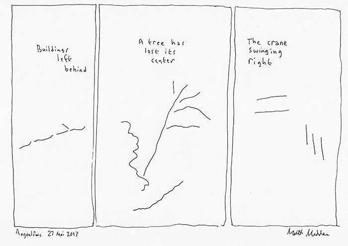
You may have noticed that I also used the words left, center, and right, in the three lines of text. The crane referred to and minimally evoked in the drawing is a construction crane over a new student center being built across the river. Of course, the association with the bird is intentional. What's interesting is that my student Lise did the same play with "grue" (above), which as in English refers to both the bird and the construction equipment.
I drew both of these comics quickly, without pencilling or much planning, with a fountain pen on letter size (A4) paper. I had in mind an interesting detail I came across which is that a haiku is intended to be read in one breath: how can we translate that idea to drawing or looking at drawings?
After I scanned the pages, though, I had the idea that the second one might work better with a less rigid panel height, something more organic and evocative, again, of the haiku's syllable structure:
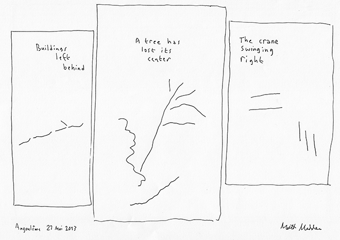 |
| version 2 |
June 24 Update
I showed my haikus to Jacques Jouet of Oulipo and he surprised me by asking why the third panel of the Corto Maltese haiku had "2 x 5" drops of rain. I was confused until I went back and looked at the page again: as it happens, if you count the raindrops in that comic you'll see that the first panel has five raindrops, the second one seven raindrops and the last panel ten (or: "2 x 5") raindrops. Total coincidence, but in Jacques' honor I've Photoshopped a Jouetian variant featuring properly syllabic raindrops:

[A slightly different version of this post appeared on the Drawing Words & Writing Pictures/Mastering Comics blog]
Read more...
