Showing posts with label process. Show all posts

Thursday, June 20, 2013

Haiku Comics

I recently taught a workshop to comics Master's students at the École Européene Supérieure de l'Image in Angoulême, France. The subject of the four-day workshop was comics based on fixed forms borrowed from poetry such as the sestina, the villanelle, or the sonnet. (If you follow my work or this blog at all you know that this is a subject I've dabbled in a fair amount in my personal work.)

One form of poetry I have not previously played around with is the haiku. Its brevity and relative simplicity of rules made it a good candidate for a warm-up activity. So after reviewing the traditional rules and reading a few examples in French and English, the students and I spent half an hour or so coming up with quick "haiku comics".

(leer en castellano)
(lire en français)


Before starting we looked at a few examples of haiku comics that already exist to see what ways the form has been adapted to our medium. One of the things I find interesting about the 5-7-5 syllable structure is that there are a number of ways to think about how that might translate to comics.

Here are two very different haiku comics I found online. The first is by John Porcellino and you might describe it as evoking a haiku rather than adapting it faithfully: the sizes of the three panels seem to refer to the 5-7-5 structure, and the text, though not observing the syllabic rules, observe many other principles of the haiku: the present tense, a reference to nature, the obersvation of a fleeting moment. One student pointed out that the framing meta-panel could be seen as uniting the comic in a single, cosmic instant.
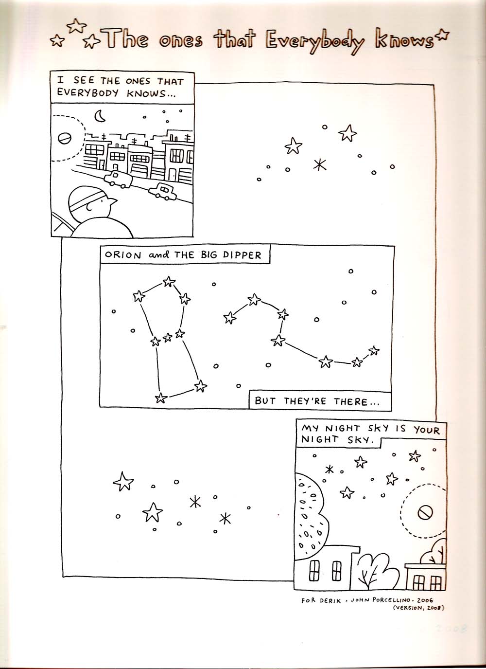
a haiku-like comic by John Porcellino
©John Porcellino

The next example is a webcomic by Mysh called Imaginary Encounters which uses the haiku has a base structure for a series of autobiographical one-page stories. In this case, the text is a fairly orthodox haiku (even if the subject matter, a dreamy gay travelogue, is far from traditional!) but the comics seems to mainly echo the three line structure in the form of three equally-sized tiers. One thing I particularly like about this example is the ironic counterpoint between the phrase "mountain top", a fairly classic nature reference, and the image of two lovers looking out their "mountain," the top-floor of window of a building. In another odd touch, we see that the place where they are is utterly flooded:
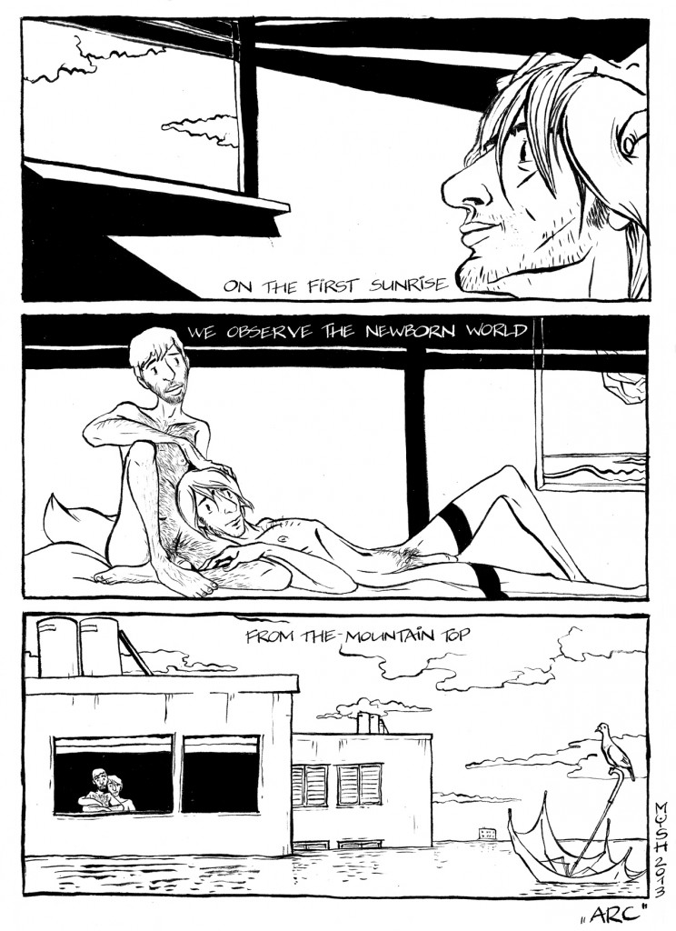
tumblr_mhnms8OCGh1qgryrpo1_1280
©Mysh

[NOTE: if you like what you see here, Mysh is currently trying to raise funds on indiegogo for a book collection of these strips. Please consider contributing here.]

We discussed other ways the syllable structure might be adapted, generally agreeing that Porcellino's relative size approach worked well.  As a counter-example: we all agreed that though a three-page comic of 5 panels, 7 panels, 5 panels would be feasible it would be too long and against the spirit of a haiku. We left it up to each student to decide which aspects of haiku to adapt and which to disregard.
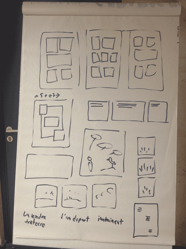
some ways to conceive of a comics haiku
some ways to adapt haiku into comics


Here are a few examples from the class:
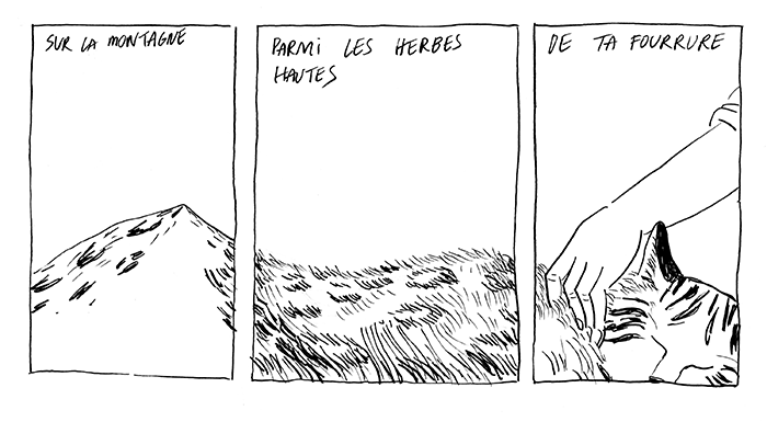
© Elisabeth Holleville

[translation: On the mountain/amid the high grass/of your fur]

© Timothée LeBoucher

© Lise Lamarche
© Lise Lamarche

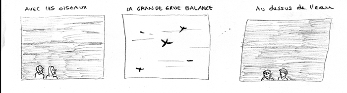
[translation: Along with the birds/the great crane floats/above the water.]

I also made a few attempts myself. In the first one I tried to write a traditional haiku, referencing the present, a season, a moment in time, and so on (it was easy to think about nature and the seasons because it's been a long, gray spring here and in most of France). That said, I couldn't help put a modern, pop culture twist to it, since I was drawing all this in spitting distance of the Musée de la Bande Dessinée, which has a statue of Hugo Pratt's Corto Maltese keeping watch along the footbridge across the Charente river:
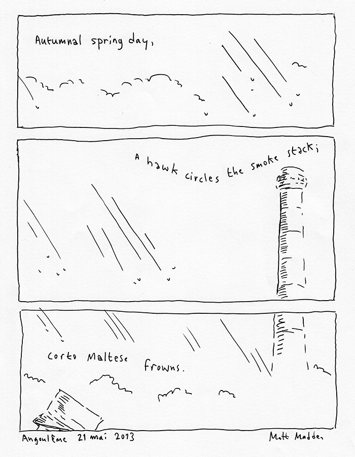
© Matt Madden

You can see that I used the 5-7-5 relative panel height principle here, cutting the space from top to bottom as the eye descends.

For the second comic, I flipped it sideways, thinking that was a more natural movement for the gaze of the haiku poet, surveying the landscape around her. An unusual aspect of this art school is that it is located on a small island right on the Charente, so when you step out, as I did, to the coffee machine, you find yourself surrounded by rushing water on all sides. It is, in fact, about as haiku-inspring a moment as you are likely to find in the middle of a city. It occurred to me that it might be interesting to translate the syllable count in to drawn lines, so in this second version I drew five lines in the first panel, seven in the second, and five again in the last. I stood in the middle of the river and looked first to my left, then straight ahead, then right:
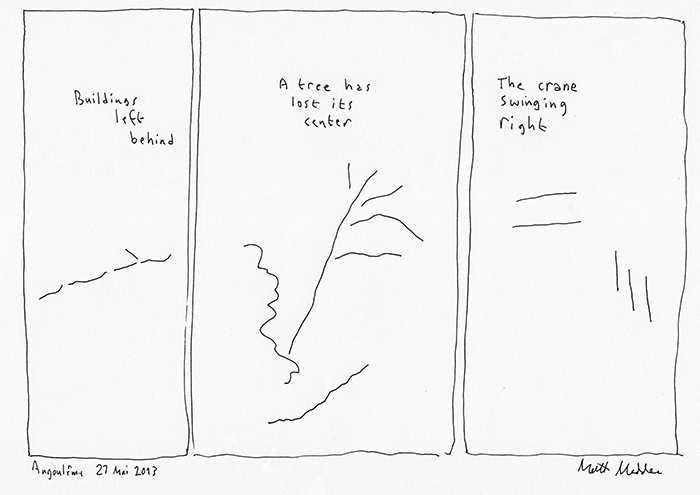
haiku #2 (version one) © Matt Madden

You may have noticed that I also used the words left, center, and right, in the three lines of text. The crane referred to and minimally evoked in the drawing is a construction crane over a new student center being built across the river. Of course, the association with the bird  is intentional. What's interesting is that my student Lise did the same play with "grue" (above), which as in English refers to both the bird and the construction equipment.

I drew both of these comics quickly, without pencilling or much planning, with a fountain pen on letter size (A4) paper. I had in mind an interesting detail I came across which is that a haiku is intended to be read in one breath: how can we translate that idea to drawing or looking at drawings?

After I scanned the pages, though, I had the idea that the second one might work better with a less rigid panel height, something more organic and evocative, again, of the haiku's syllable structure:
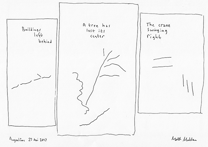
© Matt Madden
version 2

June 24 Update
I showed my haikus to Jacques Jouet of Oulipo and he surprised me by asking why the third panel of the Corto Maltese haiku had "2 x 5" drops of rain. I was confused until I went back and looked at the page again: as it happens, if you count the raindrops in that comic you'll see that the first panel has five raindrops, the second one seven raindrops and the last panel ten (or: "2 x 5") raindrops. Total coincidence, but in Jacques' honor I've Photoshopped a Jouetian variant featuring properly syllabic raindrops:


[A slightly different version of this post appeared on the Drawing Words & Writing Pictures/Mastering Comics blog]

Read more...

Monday, February 18, 2013

Bridge: a "24+7 hour comic"


At the end of January I hosted and participated in the seventh annual 24-hour Comics Day event at la maison des auteurs. I didn't finish the whole comic in 24 hours—I only got to page 16—so I devoted another seven hour day to finishing the remaining eight pages. You can read the comic and learn a bit about it after the jump.

To quickly review: the 24-hour comic was invented by Scott McCloud in 1990. The goal is to write and draw a 24-page comic from scratch in a 24-hour period. (The original instructions stipulate that you also need to lay out a minicomic and get it printed in that time!) And additional rule added over the years is to announce a starter constraint—a keyword or some kind of rule—that all participants need to observe. At the maison des auteurs event (founded by Lewis Trondheim in 2007 when he was president of the Angoulême International Comics Festival) these starter constraints have included:

  • the first and last panel must include a snowball
  • the comic must be completely wordless
  • there must be a family dinner scene in the middle of the story

This year, I was invited to come up with the starter constraint. I thought long and hard about it and consulted with previous 24 hour MCs Lewis Trondheim and Etienne Lécroart. I'm very pleased with the constraint I came up with and I'm happy to say that most other participants have been as well:

Your story has to take place in the duration of 24 units of time: seconds, hours, days, years, etc.
The time frame must be directly related to the story. Time must be distributed equally throughout the story. That is, if you are doing a 24-year story, each page takes place during one year.
The story must be 24 pages long. The first page must contain a title and the 24th page should have "the end" at the bottom.
All the pages must be numbered from 1 to 24.

I wanted to participate myself but not have a leg up by already knowing what unit of time I was going to use so I invited the gathered crowd at the opening to give me a unit of time to work with. Lewis Trondheim spoke up immediately—almost as if he had set a trap!—and proposed: decades. Meaning every page has to cover ten years and the final story will be 240 years long...

(You can watch a video of me announcing the constraint (and Lewis pouncing on me with his tricky challenge) here, part of a very nicely-done series of benind-the-scenes videos shot and edited the same day. See them all here.)


The ten-year-increment structure was not a possibility I had even considered but after a few hours interrupted by various media people I had a solid story worked out. I did less well with the planning and time management and at a certain point I realized I would not finish all 24 pages so I aimed for page 16, end of the second of three parts (roughly corresponding to three eighty-year lifespans). On Friday, February 15 I sat down and cranked out the remaining eight pages in seven hours. So, not a perfect 24-hour record but I was pretty proud of myself anyway. And to top it off, I think it turned out quite well. Here's the comic in its entirety (click on it a second time to view in full-screen mode):


You can read the rest of the finished comics here. It's too overwhelming to read all in one go but check back regularly because they feature comics at random in the top right corner where it says "à decouvrir aujourd'hui".
Read more...

Wednesday, December 15, 2010

ROYGBIV: a one-page comic challenge


I was recently invited to Belfort, a city in the east of France, to present 99 Ways to Tell a Story: Exercises in Style and to give an Oubapo workshop to art school students. I devised for the workshop, very much at the last minute, a brand new constraint which I call ROYGBIV.

The ROYGBIV constraint is straightforward but fairly difficult to pull off. Once I realized how challenging it was I felt a little bad for throwing my unsuspecting students off the deep end but they rose to the challenge.

Here's how it goes: draw a comic of 7 panels, each one corresponding to a color of the rainbow: Red, Orange, Yellow, Green, Blue, Indigo, Violet. No color allowed (that would be too easy!), black & white only. You need to find non-direct ways to reference each of the seven colors. This could be an associated object, as in a banana for yellow; a textual reference; an emotion represented (red for anger), or any other analogy you can think of. In addition to the sequence of colors, you might also consider the image of the arc, the movement between warm (red) and cool (blue) colors, as well as cultural associations with rainbows (pot of gold, LGBT, etc).

For this class we had about two hours to work so I only had the students produce rough thumbnails. A few examples follow (I apologize for the crappy iPhone pix. No time for proper scans.)

This simple yet pleasing solution made a little story of a little round creature traversing a world of fruits and vegetables: strawberry, carrot, egg, peas, (bottled) water, blueberries, finally going to sleep in a violet.
In this comic, a grad student in economics put the rainbow in the service of a narrative of the worldwide economic meltdown: a pot of gold leads to piles of green dollars floating out the window into the blue sky. Meanwhile the profit line on the graph goes into the red as the stock market symbols (commonly displayed in orange LCD) registers the crash. And we end, perhaps hopefully, with the flashing red and blue alternating lights of the NYPD coming to arrest the criminal bankers. I like how this student—in his first comic ever—used graphic elements to guide the eye through the page: the drifting dollars, the banker's laser pointer. I also like how the window and the graph function as panel borders as well as images.

In this comic there's a hidden arc in each panel in addition to the colors. Here we get a tragic life story of potential (that word!) cut short, from rosy cheeks and heart mobile to the icy violet ice floe of a frozen corpse. This is one of the few comics to make a real distinction between blue (water) and indigo (night sky)--the hardest color to indicate, we all agreed.

The kids (well, mostly teens, one 20-something grad student and two middle-aged women) were almost all energized by the challenge and most of them asked for my e-mail, promising to finish up and e-mail me their inked pages (au boulot, les enfants, j'attends toujours ces planches!).

Incidentally, on the way home from Belfort (in the midst of the nationwide strikes that paralyzed the country that October weekend) I spent the night in Montreuil, outside Paris, with my fellow-oubapian, Etienne Lécroart, who shared with me a few constraints Oubapo has been using or planning to use in France. I'll try to post about those later, possibly with examples from me and Tom Hart.
Read more...

Sunday, December 05, 2010

Tic Tac Toe Jam--a new jam comic constraint, for two players

I'd been kicking around an idea for a jam comic based on the game of tic tac toe. Recently I invited Tom Hart to meet up with me at a café before class at SVA and give it a try.

I posted about an earlier aborted comics project that led to this idea here. The idea is fairly simple: one cartoonist is X the other is O. You lay out a 9-panel tic tac toe grid on a page and play tic tac toe, only instead of simply putting an X you need to draw a comics panel that incorporates the X in some creative way. The game proceeds alternating players until the comic is finished. (Keeping track of who wins is optional.)

Tom Xs and Os...
...while Matt Os and Xs
What appeals to me about the idea is that the constraint works at a few different levels: there's visual play and word play and there's also an unsual storytelling challenge since you're not telling a story in a linear fashion, instead you're jumping from panel to panel, alternating with someone else, and trying to mold it all into some kind of coherent narrative.

game record of the above comic
In the comic above I started with the top right panel: I drew a bald guy because that seemed O-like and had him say ""Oh" as he opened and read a letter--that seemed like a story starter. Tom did the next panel and made an X out of a stack of envelopes, deciding they were summonses. We talked back and forth as we worked but didn't always know what the other had in mind. So when he wrote "24 weeks" I couldn't for the life of me figure out the reference. I decided that six more would make 30 which is XXX--a winning game in tic tac toe. It turns out he was thinking of X being the 24th letter of the alphabet. And so it goes. With the bald guy and all those X's Tom found it irresistable not to end up filling this strip with X-Men references, though we barely even know the characters (yes, we know Johnny Storm isn't really one of them).
Our other strip took a totally different direction, as you can see. In conclusion: a bit of a silly game but the results are not bad and we had a lot of fun doing it and talking about the process. This would make a great minicomic anthology. If anyone out there ends up doing this kind of comic, please send it my way and who knows, maybe I'll get enough to put a mini together.


PS As Tom points out in the comments, what we did to save time (and ensure a nicer looking final comic) was to pencil only during the jam session (as in the pix above), then we each took one home to finish up and ink.

Read more...

Thursday, June 11, 2009

An Improvised Comic Activity

Here's a tryout for an activity we're considering including in volume 2 of DWWP. It's a warm-up exercise whose goal is to activate your drawing and storytelling muscles at the same time. I'm not entirely sure how well it works so I would appreciate and comments on what follows. Better yet, if anyone is inspired I would love to see a few more attempts at this exercise. I'll make the instructions as clear as possible. The copy in bold is what I have written for the textbook draft.
Materials:

Office paper

Brush and india ink (or a brush pen)

penciling and inking tools

Instructions:
Draw a six-panel grid on your piece of paper (in this case I'm drawing in a small sketchbook about 5" x 6"):


Get out your brush, ink it up, and, without thinking too hard or planning in advance, quickly make a single mark in each panel: a line, a squiggle, a blot, in different sizes and densities.

Rinse out your brush and let your marks dry.


Look at each panel and try to see shapes or parts of outlines in the marks you’ve made: the curve of a nose, for example, or the drape of a coat, a tree, whatever. Take a pencil (or inking tool) and add to the marks, drawing what you see in your mind’s eye. Do this for each panel.

You might notice that I decided panel 5 was too sparse so I made a few more brush strokes.


Now hold the page back and read the six panels in sequence. Is there a story implied there? Look for suggestions of a narrative thread and tease it out by adding to each panel: backgrounds, new figures, dialogue, sound effects. One of your marks may lead to the creation of a character who becomes your protagonist. In that case you may choose to re-draw him in other panels to give the story better continuity and flow.

The spot in the third panel and the general barren-ness suggested by the scant marks led to me sketching a figure standing alone in a sun-bleached desert. My earliest doodles (not recorded) had the mark in the last panel as a bushy eyebrow of a full-panel face (The influence of that brow can be seen in panel 2). After a while—and looking for some kind of narrative development—I realized that mark could also be a storm cloud, suggesting an opposition to the sun dominating the other panels. The squiggles I added to the fifth panel, a zig-zaggy sort of movement, then began to suggest a rain dance of some sort.


I started to ink in my outlines with a pen (Rapidograph, but it shouldn't matter for this exercise) and to embellish with a brush pen. The backwards C shape in panel 4 eventually led me to give the character a mohawk.


This being a warm up exercise, I tried to do it as quickly as possible and as you can see noted below, I did all of this in about half an hour. I had a correction pen (a really neat one I got a Muji which I'm afraid they might not stock in NYC anymore) that I used for corrections but I tried not to be obsessive about it.


Here's a scan of the finished comic. I adjusted the levels for crisp blacks but I don't think I did much if any correction to the image:

If you decide to do your own take on this exercise I hope you'll e-mail it to me or post a link in the comments field.
Read more...